Honey store project

Building a Small Honey Shop App From Scratch
Lately, I’ve been building a small honey shop project called Mel Vô Luis, and it has been one of those satisfying projects where the scope is simple, but every improvement feels meaningful. The goal from the start was not to build a huge marketplace or a generic e-commerce platform. It was to create a lightweight, mobile-first shopping experience for a real product, with a simple admin flow behind it.
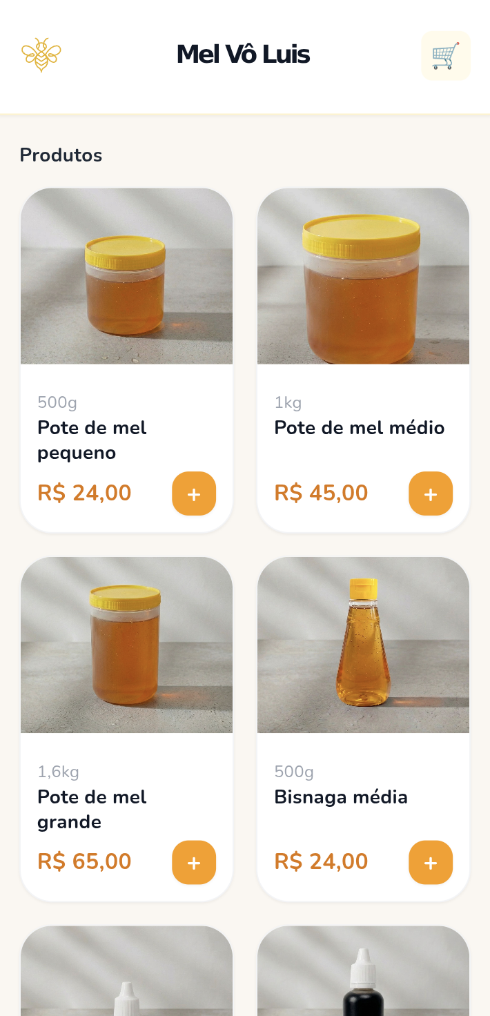
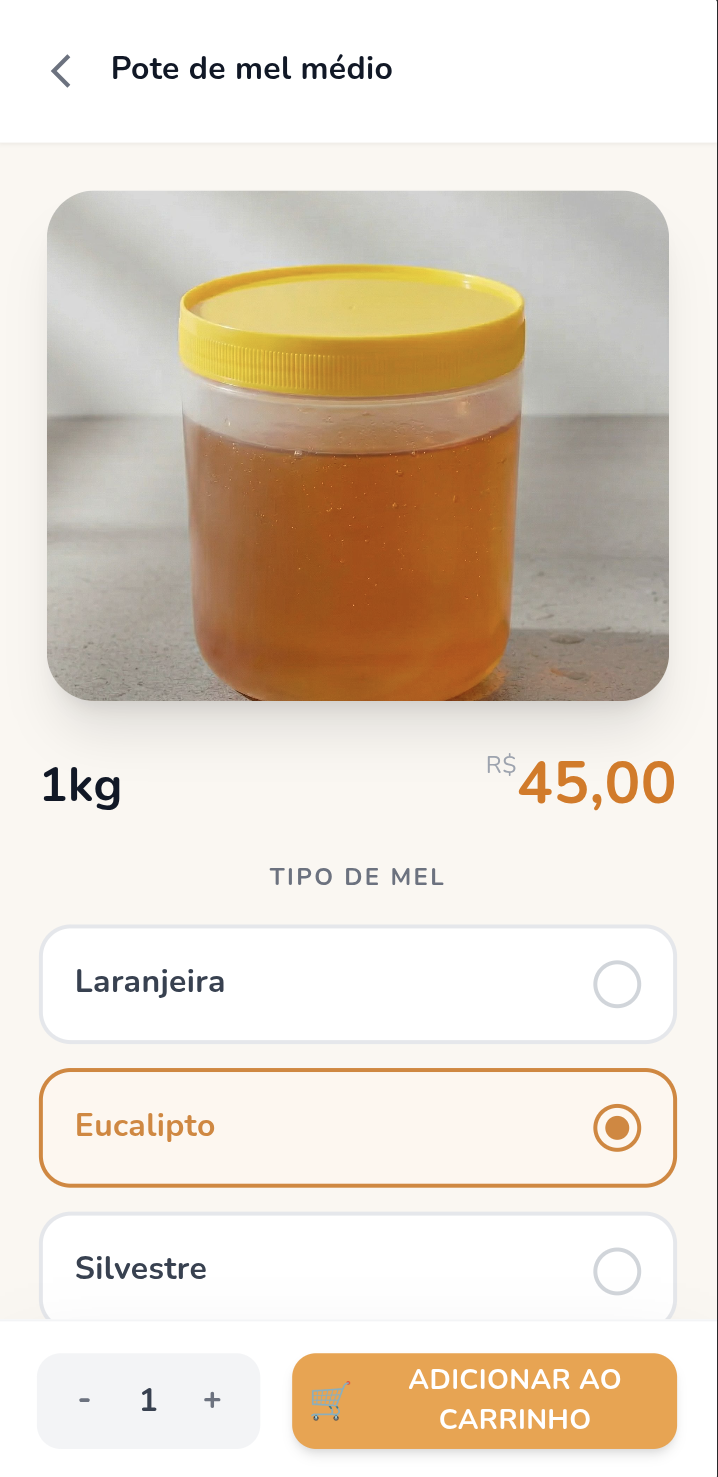
What made this project interesting to me is that it sits in a very practical space. It’s not a demo app built just to test a framework. It’s a real ordering flow: customers browse products, add them to a cart, fill in their delivery information, and submit an order. On the other side, there is an admin panel where orders can be tracked and updated.
Why I built it
My family runs a small honey business, where everything is home made. No catalogs, no data collected, no track of best seller product. My inspiration here was to create this web app to be the entrance point for new costumers and an extra tool for old ones.
I wanted to keep the MVP as small as possible. No user accounts, no complicated checkout, and no unnecessary steps. A customer should be able to open the app, choose the honey they want, provide their name and address, and complete the order quickly. That simplicity shaped almost every technical and product decision in the project.
That also meant resisting the temptation to overengineer. Instead of chasing a “perfect” architecture from day one, I focused on getting a complete flow working end to end: product selection, cart, order submission, database persistence, and a basic admin view. Once that loop worked, it became much easier to improve the UI and the internal structure piece by piece.
Stack and structure
The project lives in a monorepo and is split into separate apps for the client, the admin panel, and the backend API. That separation has helped keep responsibilities clear while still making it easy to evolve everything together.
For the frontend, I used React with TypeScript and a mobile-first UI approach. The client app is focused on a clean shopping flow, while the admin app is built around order visibility and basic management. On the backend side, orders are stored in PostgreSQL, with the API handling creation, listing, and status updates for orders.
For deployment, the frontends are published on Vercel, which turned out to be a good fit for the project. The backend originally ran on a Raspberry Pi setup, and later I moved toward a Vercel-based API approach to avoid the browser and networking friction that came from exposing a local service publicly.
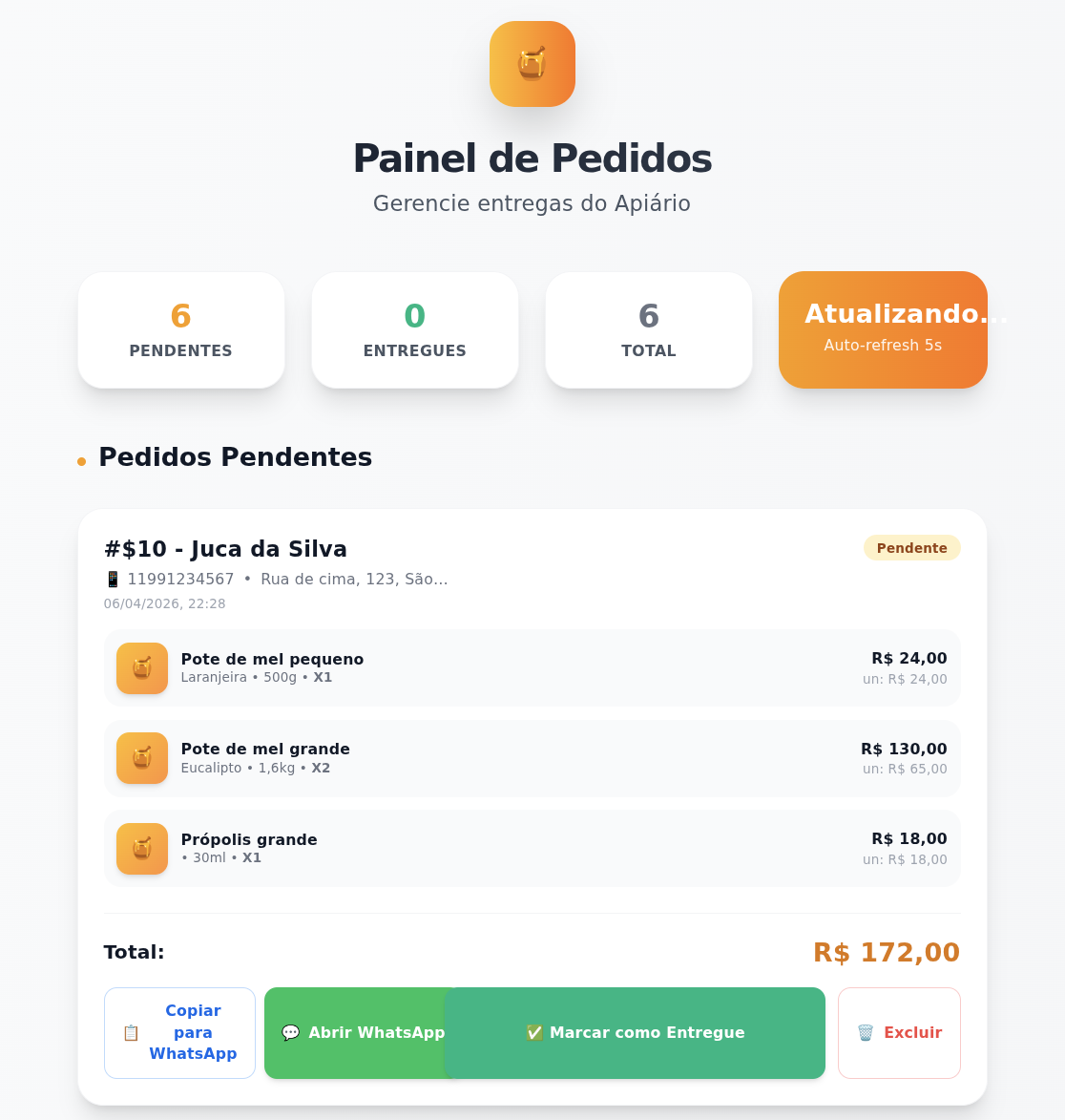
Admin panel
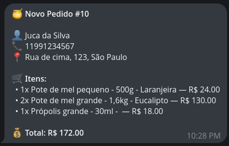
Telegram message
Architecture choices
The architecture is intentionally simple. The client talks to the API to create orders. The admin consumes the same API to list and update them. When a new order is created, the backend stores the order data and can trigger a Telegram notification so I know immediately that a new purchase came in.
That flow may sound small, but it covers the core needs of a real commerce operation: customer input, persistence, operational visibility, and notification. For this stage of the project, that has been much more valuable than adding features that look impressive but do not solve an actual problem.
Another important lesson from this build was around infrastructure. Some of the early deployment experiments worked technically, but created friction in practice, especially when a public frontend had to communicate with a backend exposed from a more private environment. Moving toward a cleaner hosted API setup made the whole system more reliable and easier to reason about.
Evolving the user experience
Once the full order flow was working, I started polishing the client. That has been one of the most enjoyable parts of the project. I refined the home screen header, added clearer visual feedback when products are added to the cart, introduced a loading state during order submission, and improved the product list so users can immediately see how many units of a product are already in the cart.
Those changes may sound small, but they make a big difference in how the app feels. A simple toast, a clearer badge, or better feedback during a slow request can make the difference between an interface that feels fragile and one that feels trustworthy. For a shopping app, that confidence matters a lot.
And since we are living in the AI era, I used Claude to help me code, Nano Banana for image manipulation and Google Stitch for prototyping.